There are 12 placement options available. Tooltips can be placed top, bottom, left or right of the target (e.g. button, icon, link, etc.) and the caret (triangle) can be placed at the start, center or end of the tooltip.
All tooltips, by default, are positioned top-center.
You can also decide to position the tooltip in a more appropriate place depending on the use case.
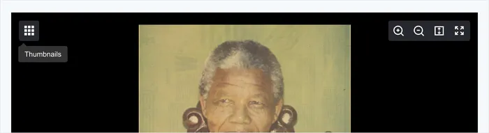
For navigational items, the tooltip should be placed to the left of the associated icon button.
For content viewing experiences, the tooltip should sit below the viewer control icon buttons.
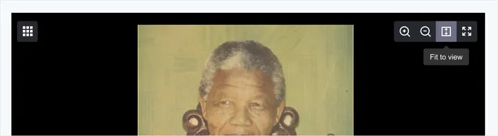
For tooltips that are near other objects or items, display the tooltip to have more contrast, prominence and readability. In the example below, the tooltip has a top placement.
For titles that need a tooltip to display the full title, it should sit above the content, so the link text is still visible to the user.
We use
Larger tooltips can be used to display further additional information. It is highly recommended that you consider if you need a tooltip or not for the design. "Throw it in a tooltip" is not the answer.
- Use tooltips to clarify expected behavior when interacting with icon buttons, buttons, or links with an associated keyboard shortcut.
- Use tooltips sparingly. If you're building something that requires a lot of tooltips, work on clarifying the design and the language in the experience. Do you NEED a tooltip?
- Don't include interactive content such as buttons or links.
- Don't include imagery, concise text will do.
- Don't use tooltips to restate visible text in the UI.
- Don't use tooltips to communicate critical information, like errors or other interaction feedback.
- Be concise and scannable
- Be written in sentence case
- Not be used to communicate error messages or critical info
1.4.13 Content on Hover or Focus AA
Tooltips give additional information to the user by providing information that isn't presented visually. Tooltips can take multiple forms, such as a label for an icon (similar to our metadata icon on the item page) or providing additional information or clarification about an element (usually in the form of a "i" or a "?" icon). Tooltips do not need to receive focus, but rather just live on the button, link or form field that it relates to. There may be additional Aria tags that need to be added to make the tooltip available to assistive technologies, such as aria-describedby.
For labels (similar to the metadata and thumbnail hover on
item page )- Use aria-labelledby and have the id share the same label
Make it the <button> attribute with a <class> attribute as well
Within the <div> add "role=tooltip" and the id attribute that corresponds to the aria-labelledby. Also add whatever you want the tooltip to give the user
Example (via Inclusive Components by Heydon Pickering)
- The role of "tooltip" assures that the aria-labelledby will work correctly
- The button role will also ensure that this works correctly
For tooltips that provide additional or clarifying information (similar to the ? next to "Stable URL" on the
item page )Similar to the structure of the example above
However, we need to add the label aspect with something other than the aria-labelledby because we need to use this for the new information
We can put the title into a hidden class to make this work effectively
Example (via Inclusive Components by Heydon Pickering)
- Reads similarly to a text label
- Announces the tooltip on hover/focus
- Pressing Escape dismisses the tooltip.
- Should be included in tab order logically
- Tooltip should open when focus is given to the element
- Tooltip should not automatically disappear
- After tooltip is closed, focus should remain on the trigger