Buttons communicate actions that users can take.
- Submit a form
- Take an action (e.g., download, save, cite, share, publish, upload, etc.)
- Progress through a series of steps
- Interact with content (e.g., zooming and paging through items on the viewer)
Button priorities are determined by the business and user goals of the area or page where they are placed, but also what users want or need to do in a "priority" order.
Use primary buttons for highest-priority actions that are required to complete the user's task.
Use secondary buttons for quieter, but still important actions. They can live on their own, be paired with primary buttons, and also paired with other secondary buttons. Secondary buttons provide less visual noise, and support the visual hierarchy of the primary button.
When you need to display multiple actions together in an array, use all secondary buttons (examples, item detail, workspace) OR one primary and the rest secondary buttons. Secondary buttons leave a minimal footprint and aren't as heavy of a distraction within the UI, and primary buttons are reserved for the most important action.
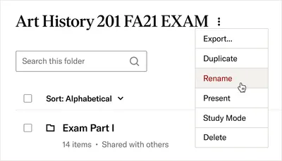
If it makes sense to group multiple actions together, you can utilize an ellipses button paired with a dropdown menu. Use this pattern when there are 3 or more actions. Use this pattern sparingly as it does hide actions and adds an extra click for users.
Links navigate users to a new page or location. Buttons specifically allow users to perform an action that stays within the context of the page or experience (e.g., the citation button opens a modal or the download button directly downloads an item). There are times where buttons need to act like links and look like buttons to create consistency with the experience. Please read about this variant below and use sparingly in your UI.
- Buttons should be easy to find among other elements, including other buttons
- The button's content should be clear and accurately labeled, encouraging a user to take action with an action-oriented verb
- Prioritize actions within the page and experience based on business and user needs. For most use cases, only one primary button should be used on a page so users are clear about what the most important action is.
- Use the best variant for your UI needs to communicate meaning and hierarchy.
- Utilize multiple primary buttons in an array, this causes an imbalance of hierarchy and confusion about what actions should be taken. Reserve primary buttons for the most important action when displaying a series of buttons.
- Don't use dropdown menus in cases when data is commonly known and easier to type
- Don't use a button variant for an action it's not intended for.
Buttons should lead with a strong verb that encourages action. To provide enough context, pair the verb with a noun when applicable.
Save Workspace
Find my institution Institution finder
Button text should suggest its action in an expected way and in the fewest words possible. Buttons should be clear, concise and written in sentence case. Avoid unnecessary words and articles such as the, an, or a.
Cite Click here to copy the citation
Download Download the PDF
Make interactive elements consistent in identification and functionality. Don't label a search button "submit" on one page and "enter" on another.
Use for primary actions in the page or experience.
Use for secondary actions in the page or experience. They can also be used for quieter, but still important actions.
Use subtle buttons when other types may be too distracting or visually verbose for the area in which it's placed.
Use overlay buttons when the button can appear on top of other content like images
Pair text with an icon to better clarify the meaning of the button. Use no more than one icon
before text and one icon after text (see
Use icon-only buttons sparingly and include a label, in most cases that would mean using a tooltip to help visually provide meaning to the action. They should be used only in compact UI situations. Use an icon that conveys a single action.
Only to be used when implementing input groups that use a button so that it matches the height of the input field.
Use these under careful consideration. Dictation software users may not be able to properly identify these actions, as they can say "show buttons" and these won't highlight since they are semantically links, even though they may look like buttons. These should be used sparingly.
Use the disabled state of a button when a user can't perform an action at the time of their experience. They should be used sparingly and only for actions that they are unable to take. The user shouldn't have to guess why a button is disabled. It should be immediately obvious as to why the button might be disabled (e.g., an item can't be downloaded due to access). Otherwise, show the button in its default state, then provide helpful error text after it's been clicked.
When a button is used on a darker background (e.g., black or marble-gray-20), use the is-on-background attribute. The four variants described above can all be used on dark backgrounds and follow the same guidelines.
- Ensures component uses the correct semantic
buttonelement. - Provides built-in focus styles that meet WCAG contrast and visibility requirements.
- Supports keyboard interactions (e.g., Enter/Space to activate).
- Includes ability to add ARIA attributes when necessary (e.g.,
aria-labelfor icon-only buttons). - Variants use predefined color schemes that meet contrast requirements.
- Ensure button labels are clear and descriptive (e.g., avoid vague labels like "Click here").
- Use the disabled state sparingly, as there are known accessibility and usability issues (it removes buttons from the focus order and can add to a users cognitive load). Consider alternative approaches, such as keeping buttons enabled but providing inline messaging about availability.
- Ensure annotations are used to convey the button's label if using icon-only.
- Avoid nesting interactive elements (e.g., placing a button inside a link).
- Use the following attributes as needed:
a11y-label: Gives explicit an accessible name with an aria-label attributea11y-expanded: Conveys associated content’s state with aria-expandeda11y-pressed: Conveys the current pressed state with aria-presseda11y-haspopup: Indicate an association with another widget via aria-haspopupa11y-disabled: Conveys the disabled state via aria-disabled while keeping it in the focus order
VoiceOver reads as: "visual label (or aria-label), button"
1.3.1 Info and Relationships A 2.5.3 Label in Name AA 4.1.2 Name, Role, Value A